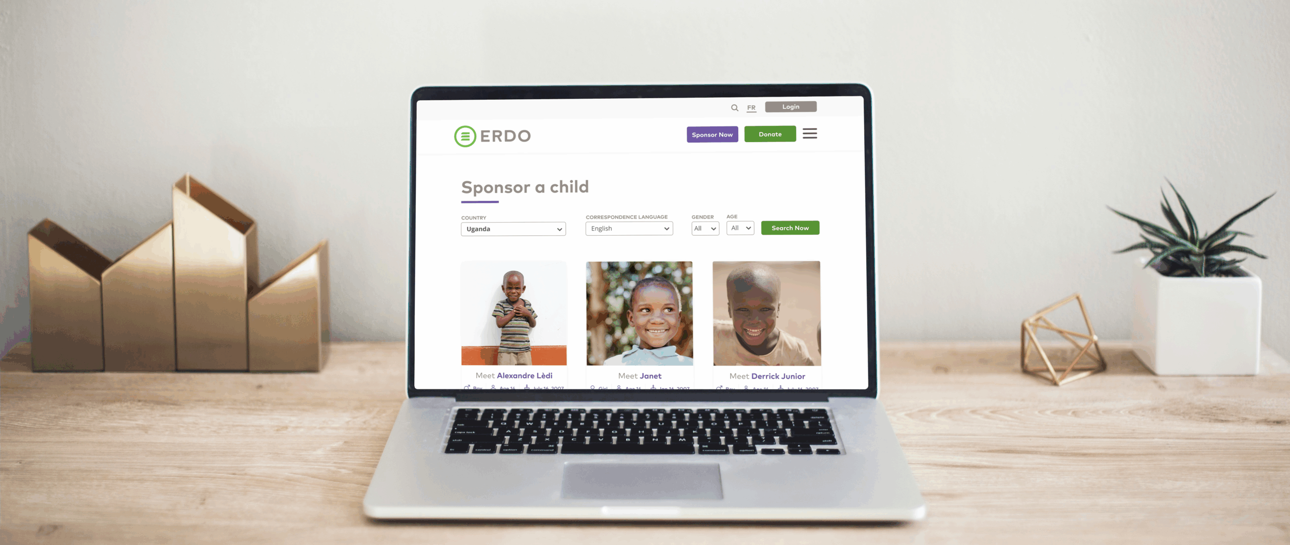
Redesigned to enhance child sponsorship engagement

overview
Inside the project
ERDO is a charity that brings aid to countries in crisis and runs a major child sponsorship program, helping provide children with education, food, clean water, and medical care. The previous online experience made it difficult for visitors to navigate and sponsor a child. I led the redesign, collaborating closely with the project manager, development team, and business analysts. Our goal was to create a more intuitive user flow that would encourage more people to take action and make sponsoring a child seamless and meaningful.
Quick Snapshot
Client
ERDO (Emergency Relief Development overseas)
What
Improving the child sponsorship experience and checkout
Results
ERDO has since gotten over 100 donors and counting
⚠️ Signed under NDA: Due to a non-disclosure agreement and to protect client confidentiality, some details may be intentionally vague.
the problem
When giving becomes hard
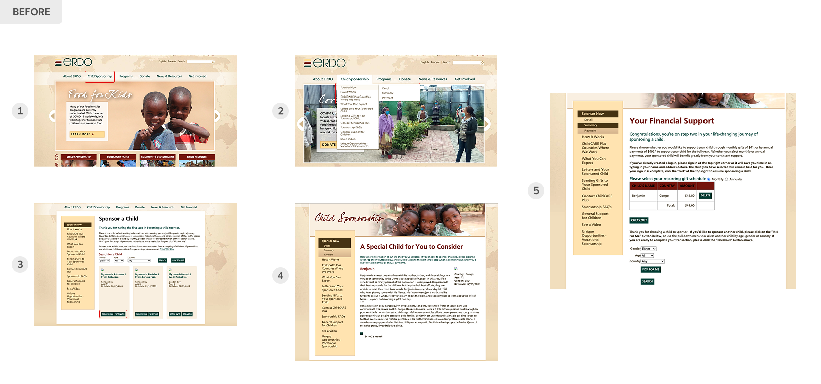
After auditing the previous flow and reviewing user behaviours with the team, I identified 3 key points. These issues not only frustrated users but also created problems for our client.
1. Cluttered Navigation
Users struggled with an overcomplicated submenu structure that made it difficult to find a clear path to sponsor a child.

2. Lack of Progress Feedback
There was no indication of how far users were in the sponsorship process, leading to confusion and drop-offs.
3. Backend Integration issues
The old system forced donors to call in their sponsorship, causing operational inefficiencies and making it difficult for the internal team to track donor data effectively.
research & analysis
Digging Into the Old Site
Reviewing the previous flows revealed a few key issues:
- Too many sub-menus under the “Child Sponsorship” tab, making it difficult for users to find a clear path to complete their monthly donation.
- The page layouts were disorganized or overwhelming, which added to the confusion.
- The user flow lacked clarity and needed significant improvement.
challenges for our client
Bridging the Data Gap
Data collection challenges
New system integration
To improve data tracking and donor management, the team planned to integrate Raiser’s Edge NXT (RE NXT). This integration was a key consideration in shaping the updated userflow before moving into the interface design.
Visualizing the user journey
Helping Users Feel More Confident
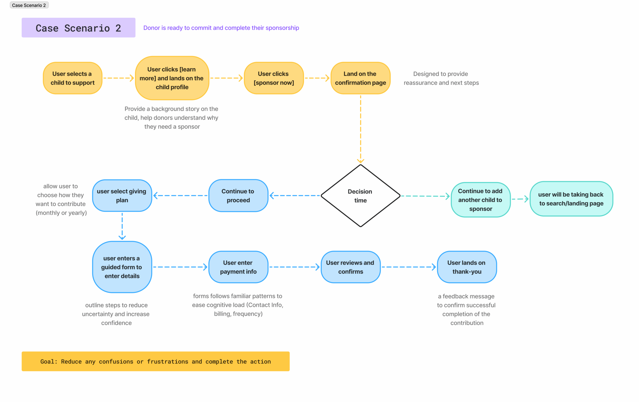
Based on our learnings, I mapped out a few real case scenarios and helped spot key areas for improvement in a broader view. With a stronger foundation in place, we were ready to bring the experience to life though a more intuitive and streamlined user interface.
Bringing vision to life
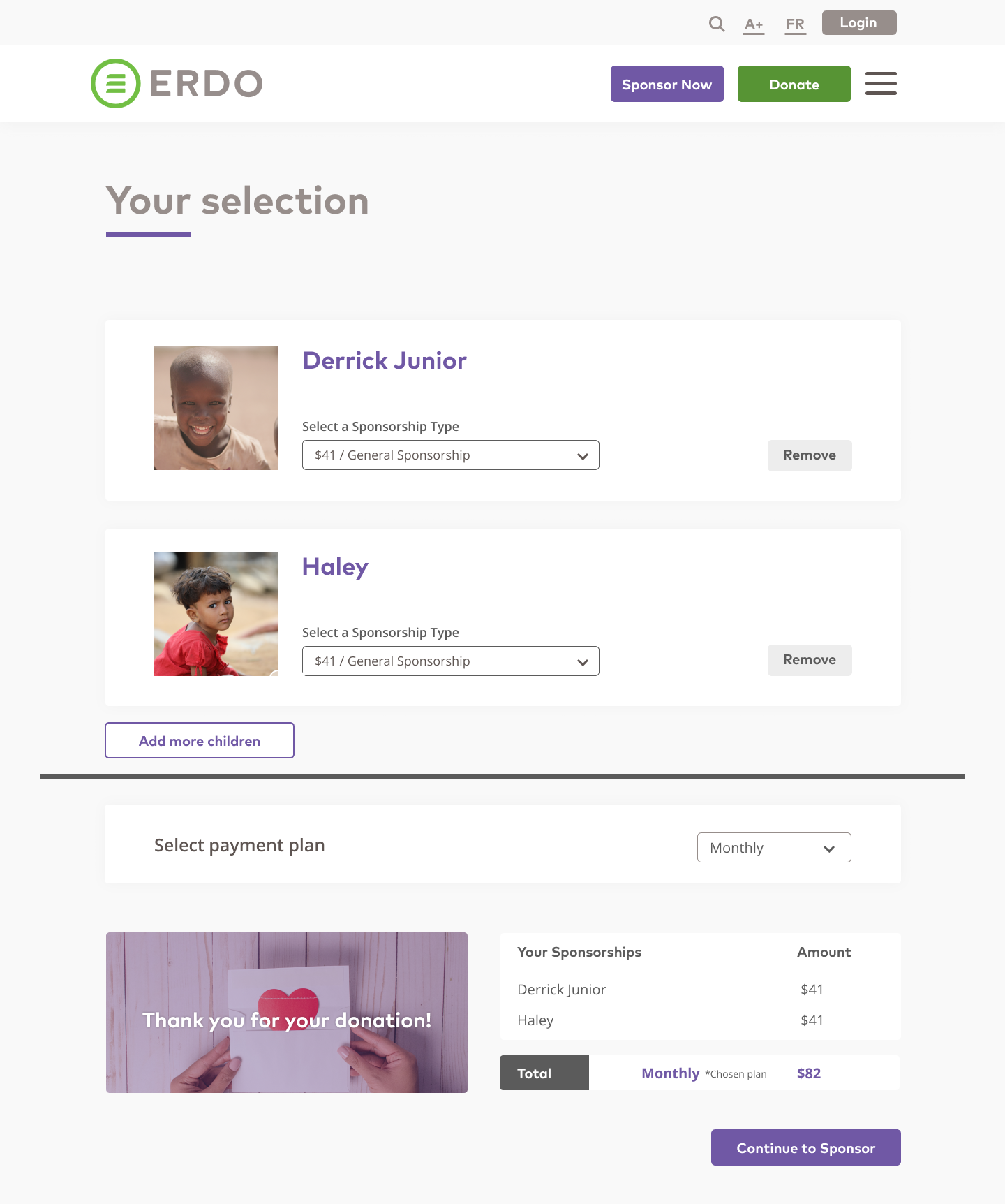
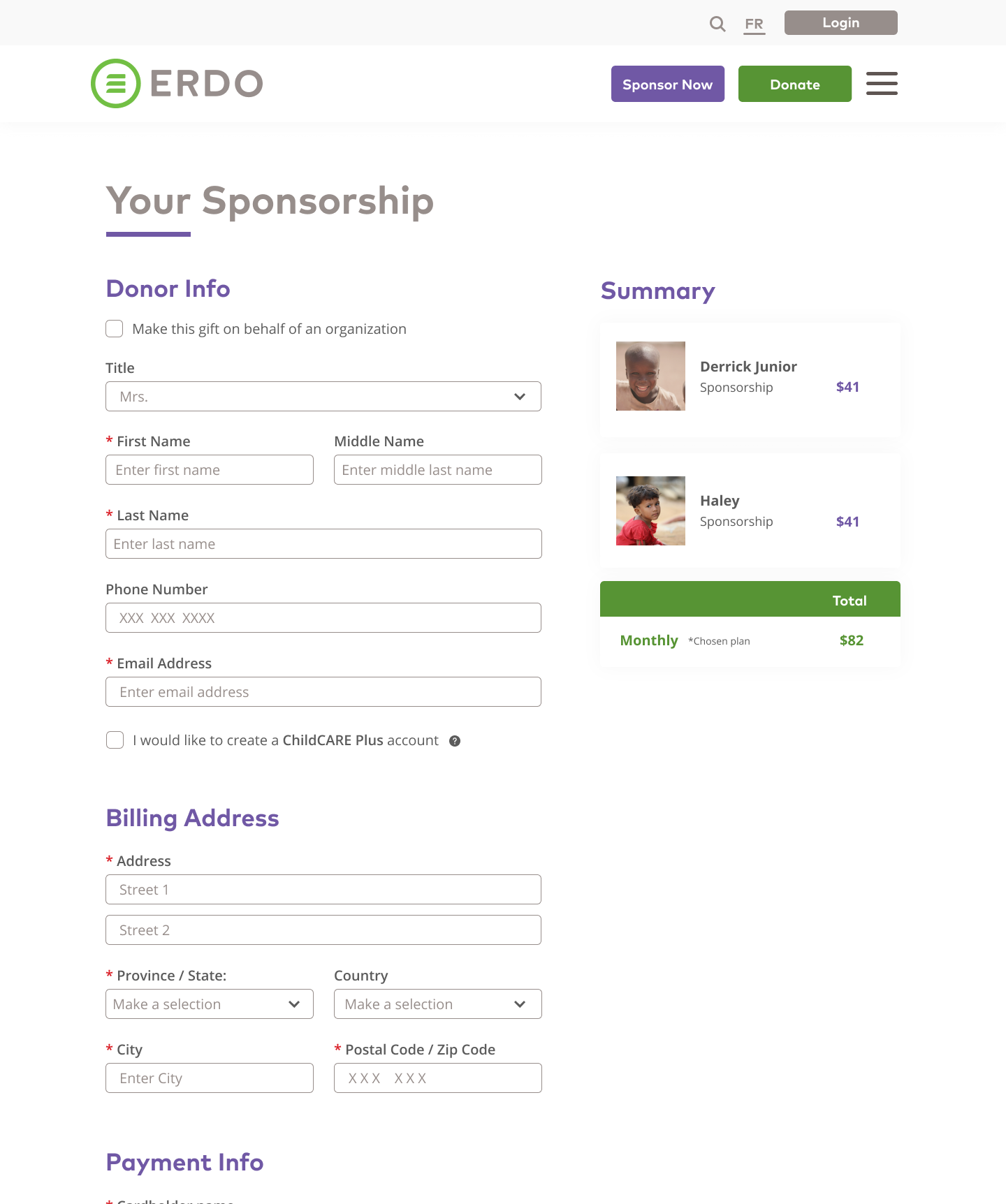
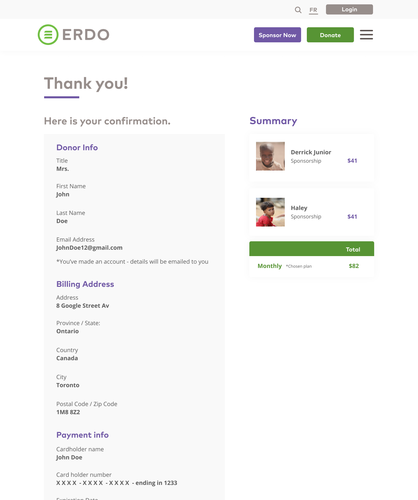
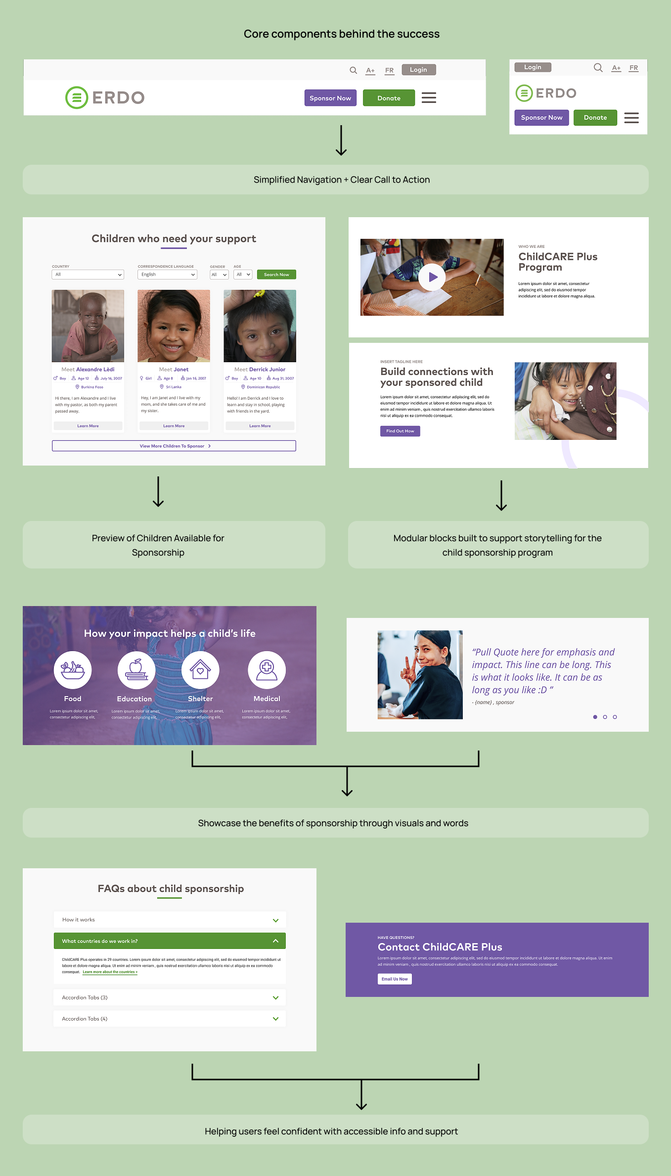
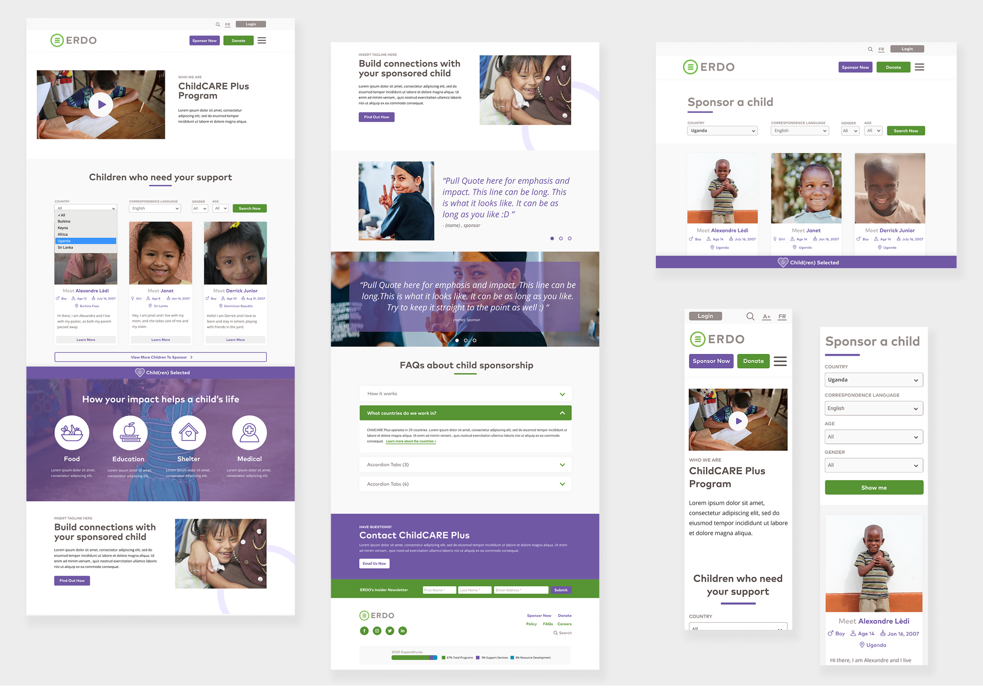
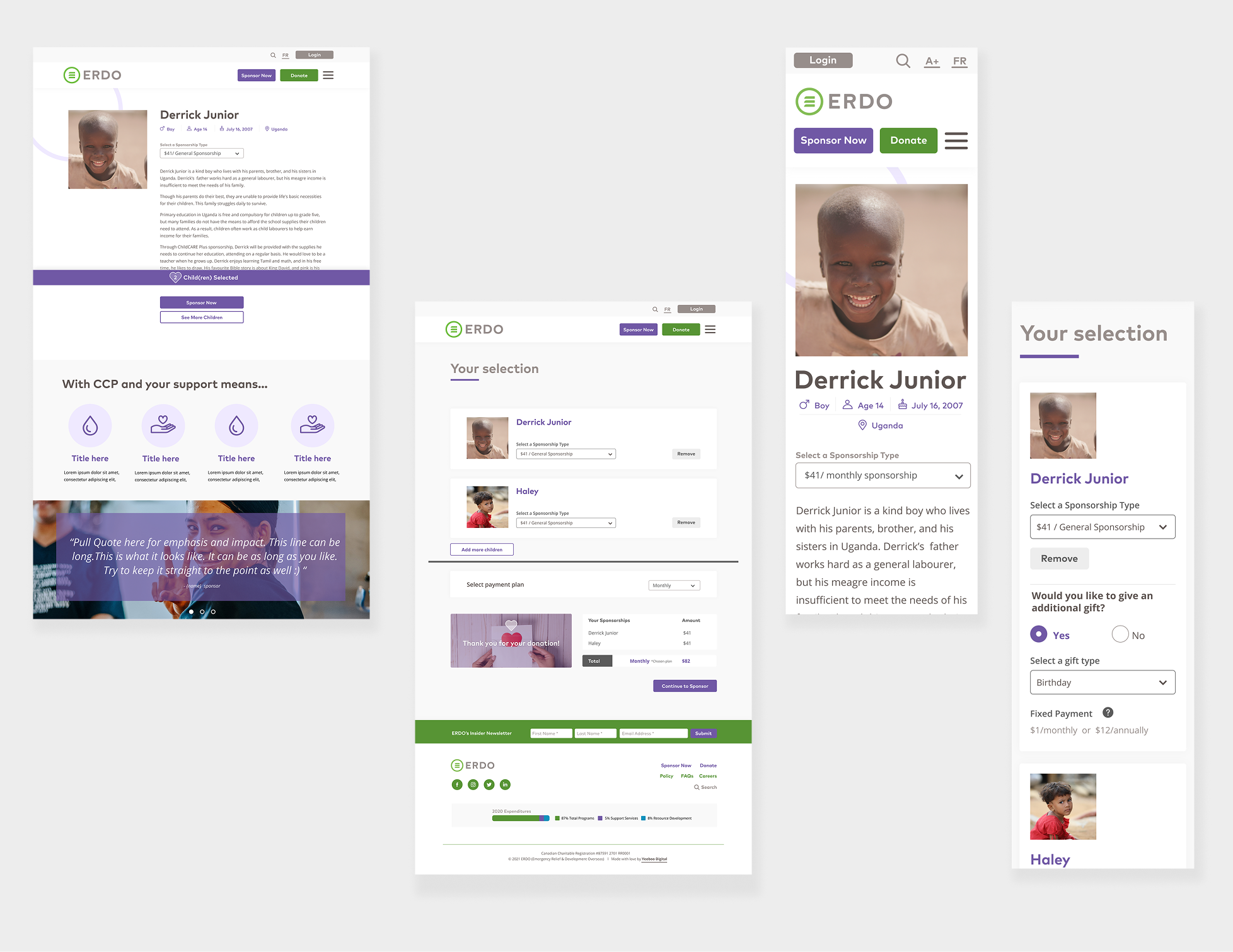
With a clear direction in place, I moved into high-fidelity designs—applying the brand, accessibility best practices, and streamlined interactions. I collaborated with developers to hand off design specs and assets, making sure everything came together smoothly and aligned with our goals.
Results
Over 236+ children have been sponsored
reflection
Lessons learned
- Team collaboration is important: Working side by side with developers, project manager and senior analytics showed me how much design touches everything – fro content to backend systems. Asking questions early help save time and build trust.
- Designing with emotion matters: In the nonprofit space, emotion goes a long way. Using visuals and story telling helped create empathy which leads to people to connect and donate.
- Transparency builds trust and drives action: We help the client see how simple visuals and honest messaging about where donations go made people feel confisent and more willing to support a child.
- Understanding the tech helped my design process: Getting filiamar with APIs and backend systems helped me design smarter. Knowing what data could be automated or updated live made it easier to shape the experience around what was possible.
See more screens


